Getting Started
Thank you for purchasing Blackery Shopify Theme. If you have any questions that are beyond the scope of this help file, please contact us on our Dedicated Support Platform. Thanks so much! The HTML code is 100% responsive and adaptive to different devices. The code is valid and cross browser on each modern browsers. It used the HTML5 and CSS3 technics.
In this user guide you will find all required information to get your site up and running: starting from theme installation and setup.
This file is really extensive so you might think the theme is hard to use, actually it’s not, you probably just might jump to the options page and explore everything yourself, this file is more of a reference work if you do not know what to do, or if you are not familiar to Shopify.
When you make changes in Theme Customizer, in case you do not see the changes on Home page (or any other page), please try refreshing the page one more time, or go back to the admin and 'Save' again. Shopify is sometimes "slow" when applying changes. In Theme Customize screen, some 'Sections' widgets are not fully rendered when change is applied, so it is always better to check the store preview (or refresh the whole Theme Customize page so changes are visible).
We hope you will enjoy working with our themes. Yours sincerely, Anvanto.
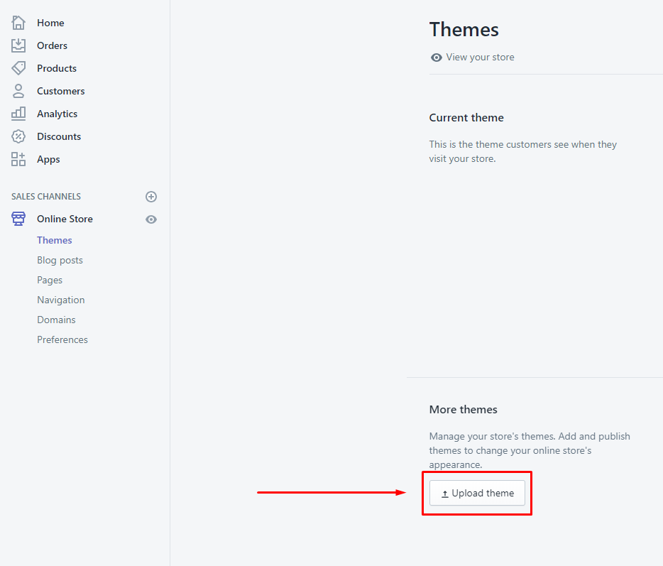
- Open your Shopify back office, then Online Store -> Themes on the right side bar
-
Press “Upload theme” and select the blackery_v1.0.0.zip file
-
When the theme is uploaded, open the “Actions” tab and press “Publish”.
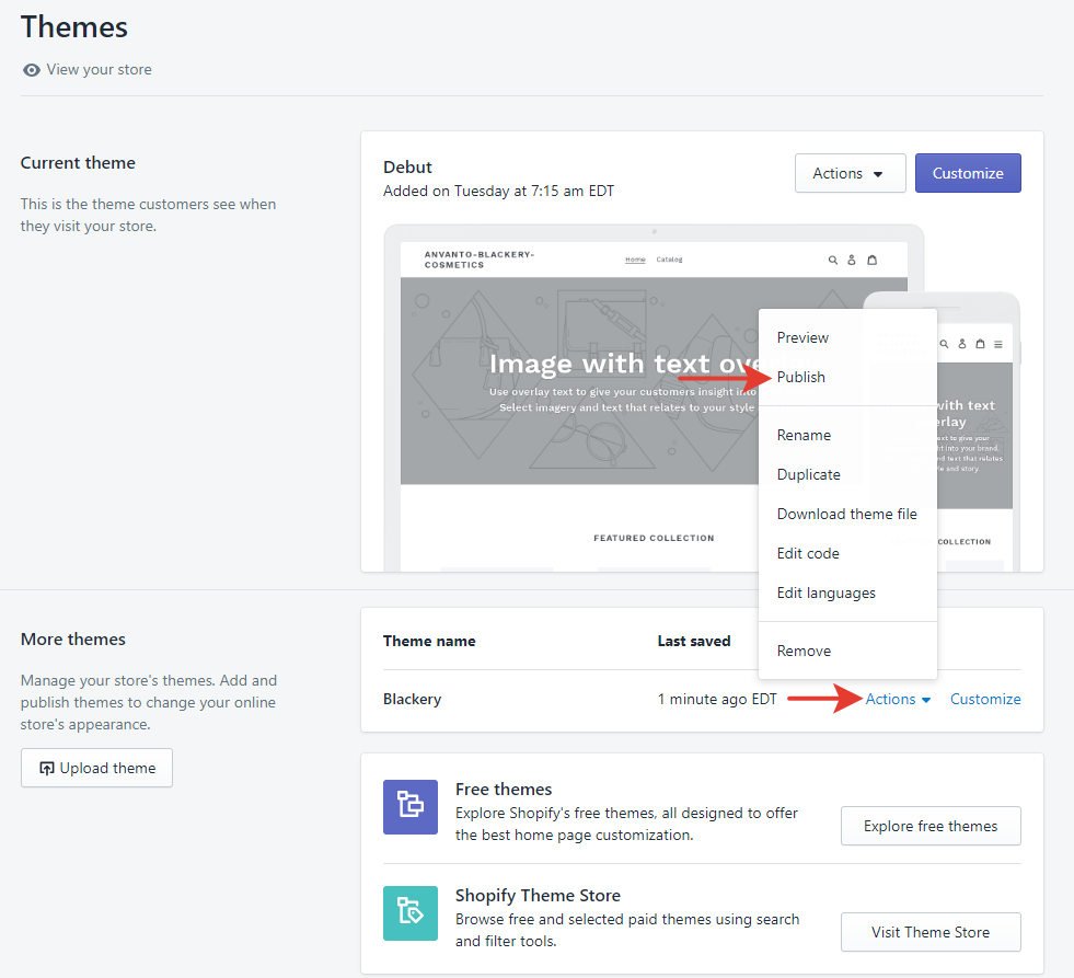
To keep your theme settings make the following steps:
- Copy the settings of the previous theme version (Online Store -> Action -> Edit code, then open the config/settings_data.json file)
- Paste the settings in the same file of the new theme version.
- Install Product Reviews app. (free, optional, product reviews).
- Install Weglot Translate app. (free to install, additional charges may apply, optional, translate your Shopify store into multiple languages ). Contact us to get a 20% discount code.
Demo content files are included in the downloadable file (that you have downloaded from ThemeForest)
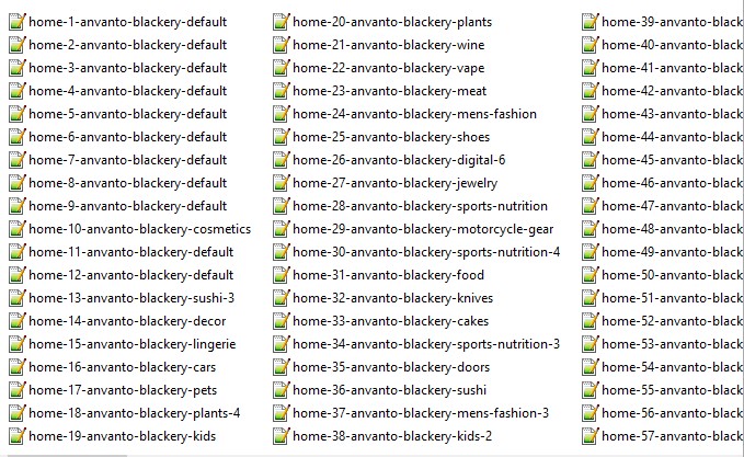
Open "DEMO Json" folder
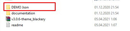
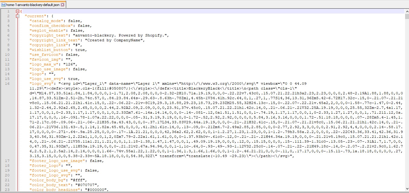
Open the file of your chosen style and Copy all data
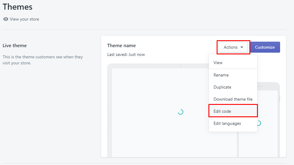
Open your Shopify back office, then Online Store -> Themes on the right side bar
Open the "Actions" tab and press "Edit code"
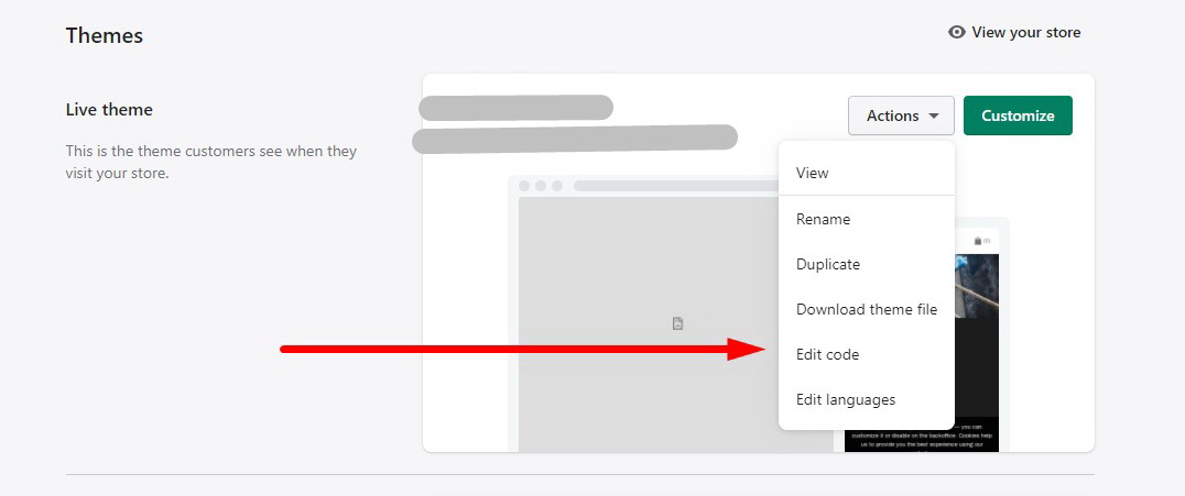
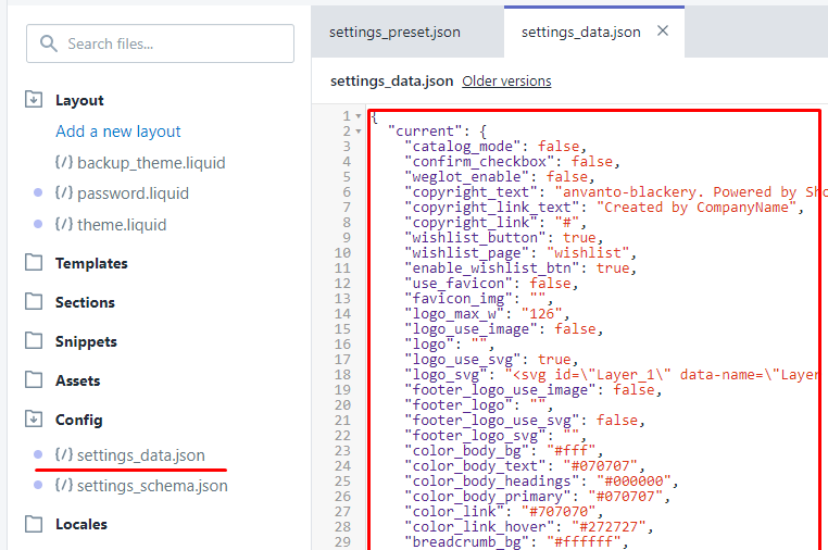
- Open the config/settings_data.json file
- Open the "settings_data.json" file and replace the content with the copied data.
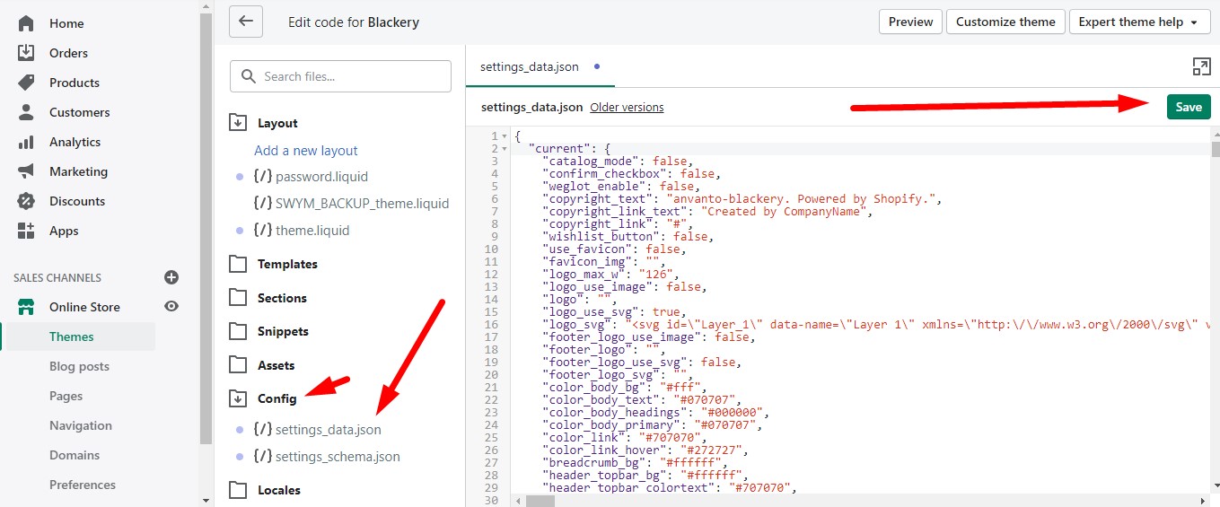
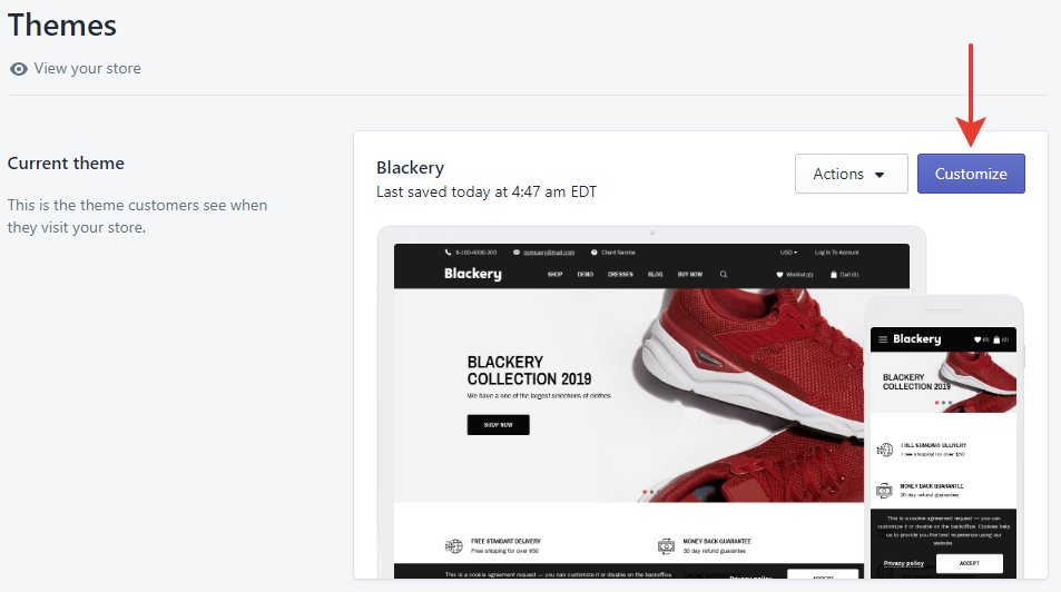
- Press "Customize" button to move to sections and theme settings editing menu.
Note: Do not forget to press the “Save” button every time when you make any changes.
General
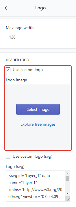
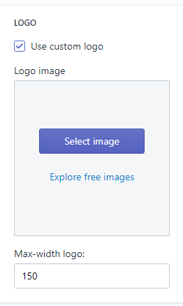
Open Theme Settings -> Logo.
If you want to upload an image logo, then check the «Use custom logo» checkbox and upload the logo you want.
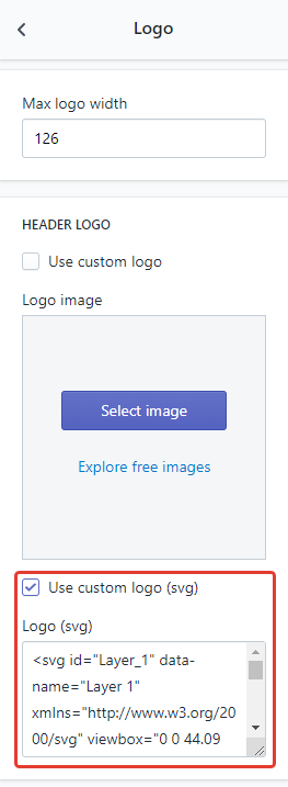
If you want to use an svg logo, then check the «Use custom logo (svg)» checkbox and paste the logo svg code.
The process of changing the logo in the footer is the same, just use the fields below.
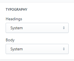
Select the “Typography” tab.
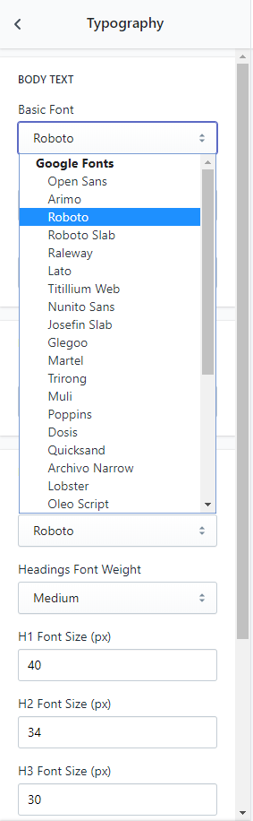
Here you can customize main styles of the font for the body and titles with any of 31 Google fonts.
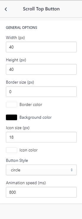
Here you can customize a scroll top button. Available customization parameters are size, button style, colors, icon and border.
Here you can manage currencies used in your shop. Specify the currencies you accept into the appropriate field.
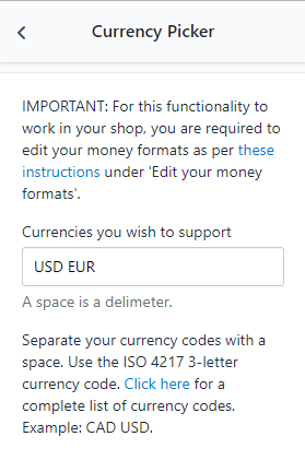
Open Settings -> General, then press Change formatting. For the currency picker to work properly is requried to paste a piece of code — <span class=money>${{amount}}</span> HTML with currency value.
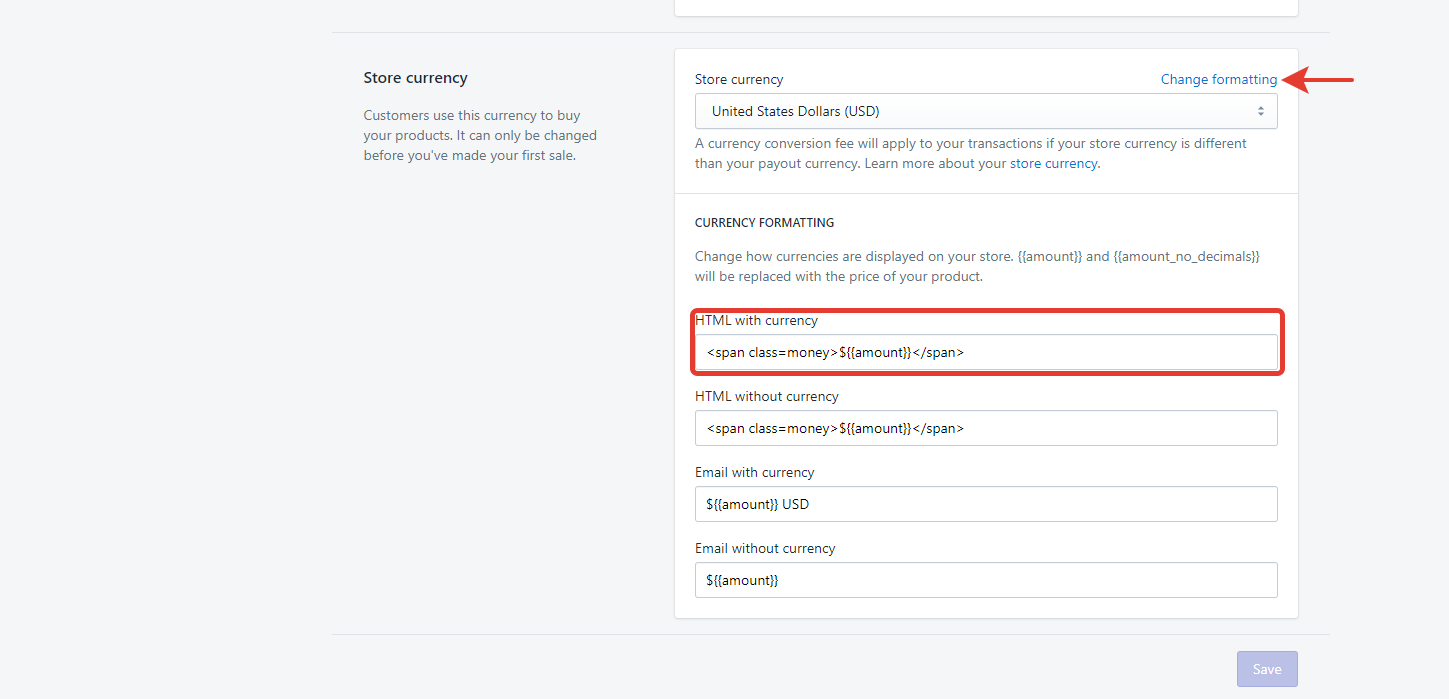
Note: The obligatory condition is to change internal currency parameters. An instruction how to change them is available on the link.
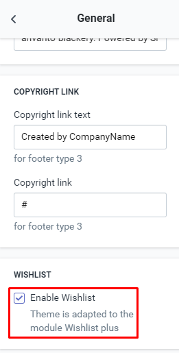
Open Theme Settings -> General enable displaying wishlist with the appropriate checkbox.
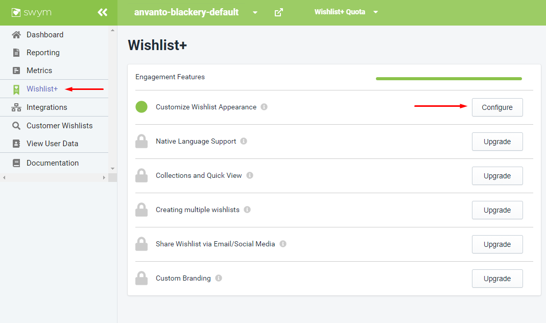
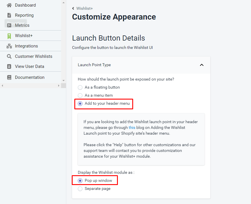
Install the Wishlist Plus module. Open the module settings, then Wishlist+ -> Customize Appearance and select the following values.
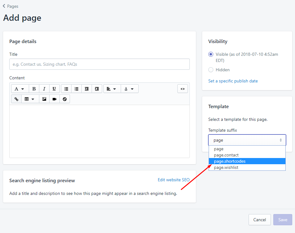
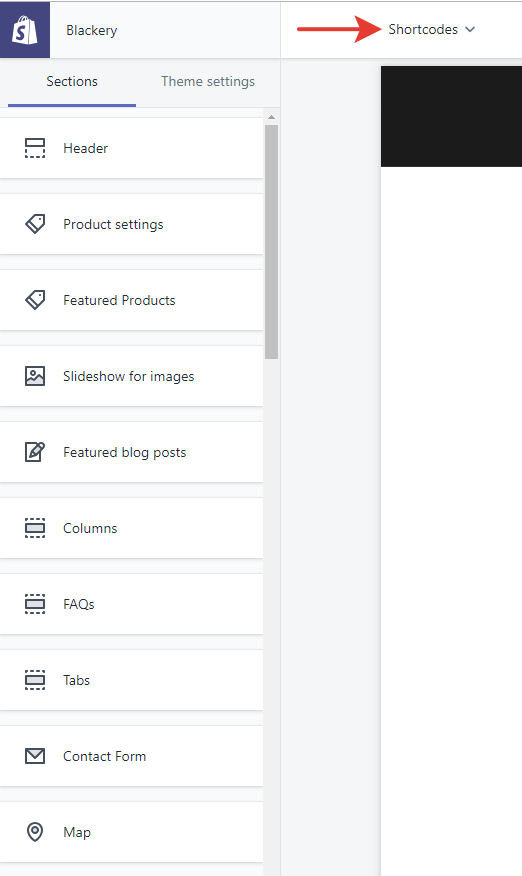
Using Shortcodes, you can add any widget (columns, slides, banners, buttons, icons etc.) TO ANY PAGE (static page, product page, collection page, blog article etc.) to give it a unique content and create a product landing pages with more info about the products.
Go to your Shopify pages, create a new page, name it Shortcode Generator and select page.shortcodes template. Go to theme Sections, select this newly created pages and shortcodes generator sections will appear with preview available in the theme preview screen.
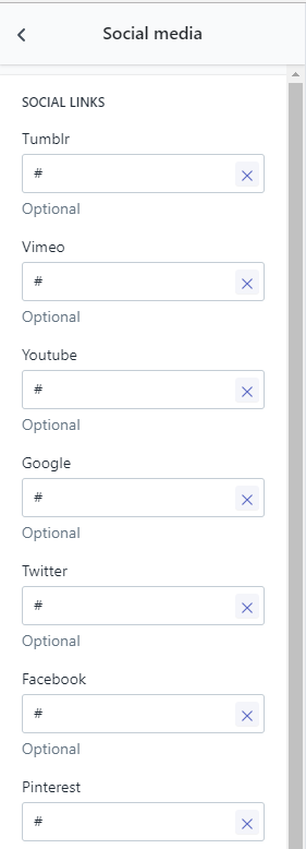
Open Theme Settings -> Social Media.
Here you can configure social media icons and links at the top of the theme. You should paste links of your social media accounts into appropriate fields. If you want to disable some icon just delete the entity of the field.
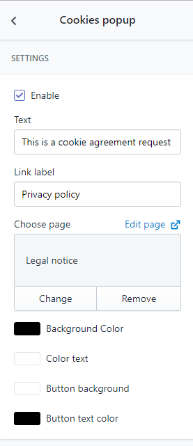
Open Sections -> Cookies Popup
Enable or disable the popup with the appropriate checkbox.
Enter the message of the cookies agreement request into the «Text» field.
The agreement request contains a link so that users can find more information on your privacy policy. Enter the title of the link and select a static page where the link leads.
Finally, customize colors of the popup background, text and button.
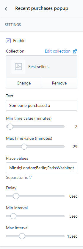
Open Sections -> Recent Purchases Popup.
Enable or disable the popup with the appropriate checkbox.
To define products which are shown in the popup select a collection.
Enter a start text of the popup such as «Hurry up! Someone purchases a» etc.
Enter locations which are displayed in the popup.
Finaly, configure timings:
- Min time value and Max time value (in minutes). These timings define the time interval where the purchase in popup can be done.
- Delay. The timing defines the time the popup appears for. For example, if you set 5 seconds, it appears to users for 5 seconds and then disappears.
- Min interval and Max interval. These timings define the popup appearance frequency. Every time it appears randomly in the limited interval.
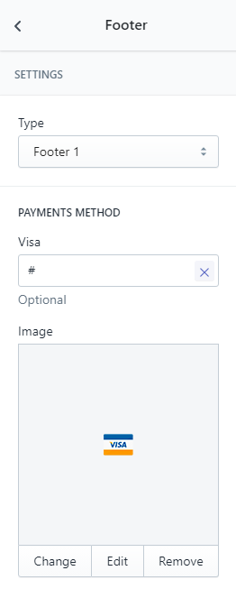
Open Online Store -> Pages, then select one of 12 footer types. Upload icons of available payment methods and, if neccessary, paste links.
Enter a title and add content to the page with the editor, select a page template, then press Save.
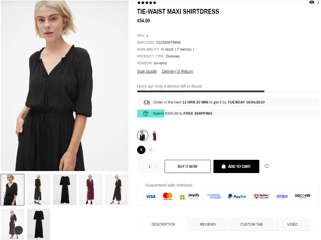
Product
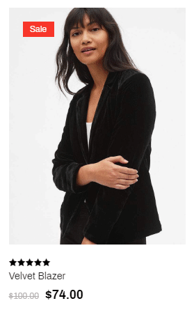
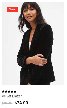
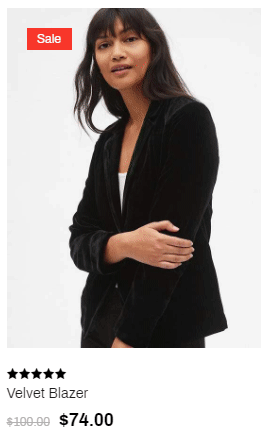
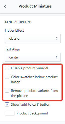
Open Theme Settings -> Product Miniature. Select one of 3 hover effects of the product thumbnail:
-
classic
-
fade
-
slider
Configure variant settings: disable them in the miniature, place color swatches below the image or remove them from the image.
To create variants follow the link and use the instructions.
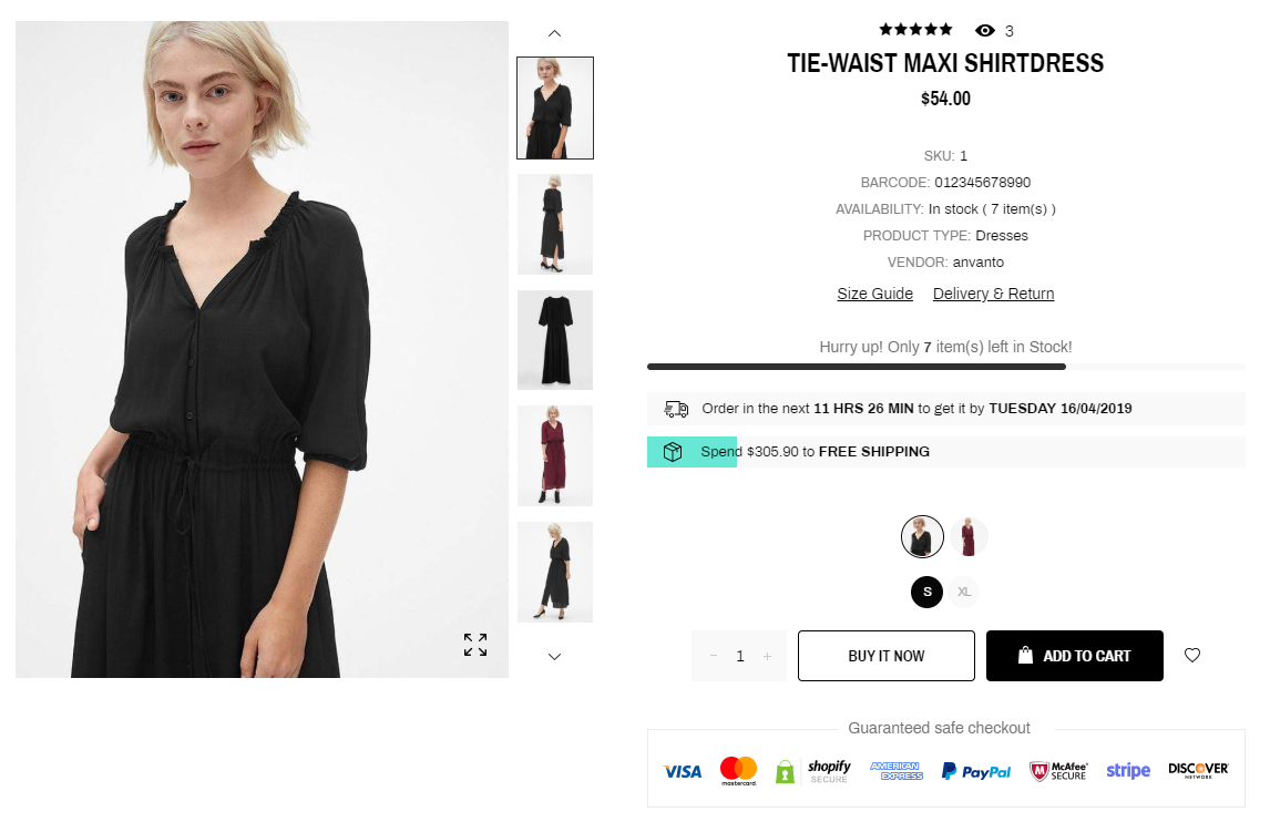
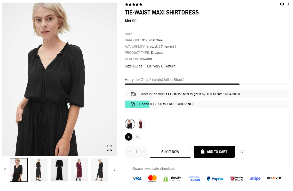
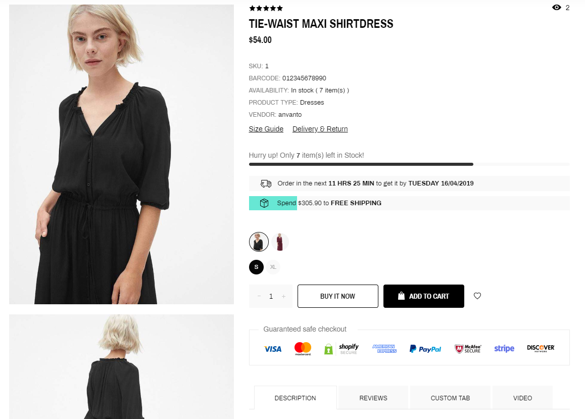
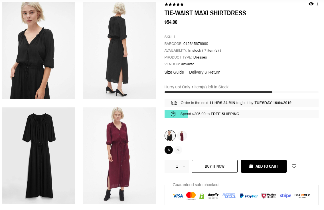
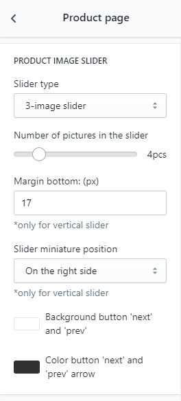
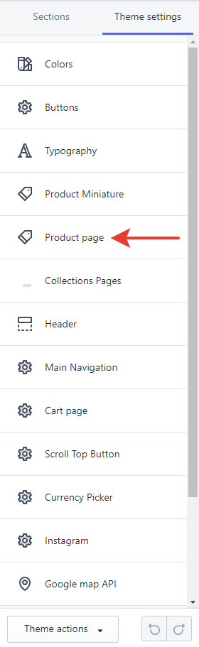
Open Theme Settings -> Product page. Select one of 6 product page layouts:
-
Vertical Slider
-
Horizontal Slider
-
List
-
Gallery
-
Slider & Grid
-
3-image Slider
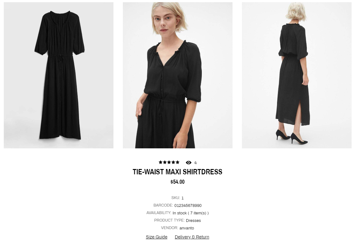
Select the number of images in the slider (if enabled). Set colors of «Next» and «Previous» arrow buttons.
If you use Vertical Slider, select a Slider Position (left or right) the Bottom Margin of images in the slider.
To create variants open Products and create or edit a product. Press the "Add variant" button, enter the option title and all the possible values.
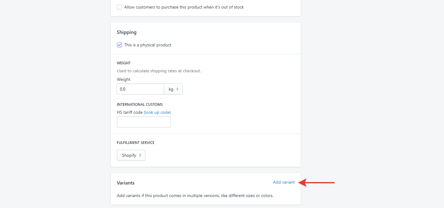
Press the "Add another option" button if you need more ones.
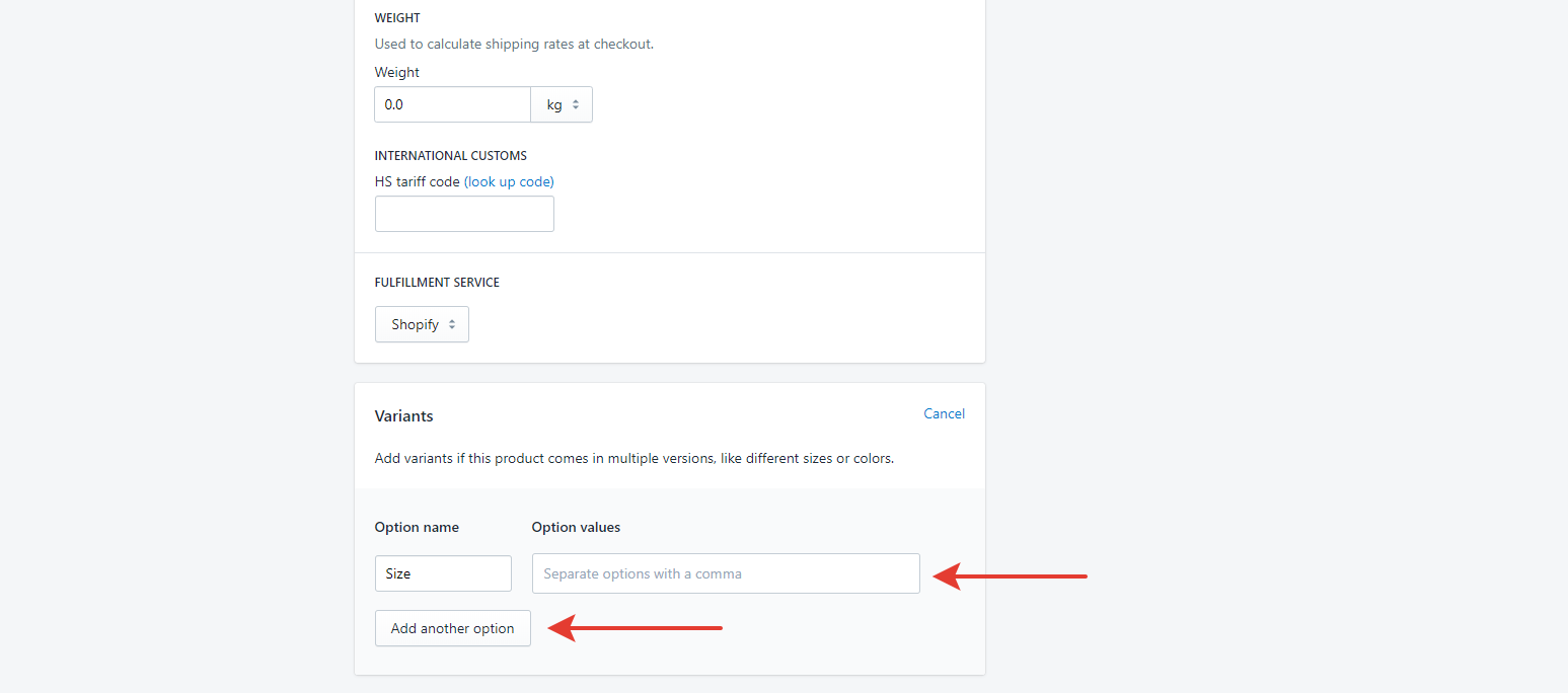
To link variants with filters create tags in the [Option name]_[Option value] format, for example, Size_XL.
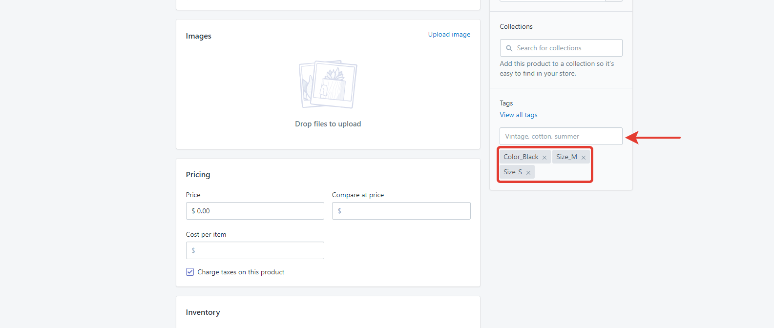
Note: Use color names from the X11 chart. If a color name constists of 2 words, type them without a space in 1 word, for example, Deeppink.
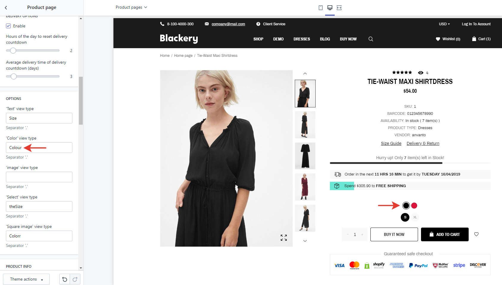
To customize option view types in the product pages open Theme settings -> Product page.
There are 5 possible option view types. Enter the desirable option into the field of the view type you want to display.
How to customize view types of product options for Shopify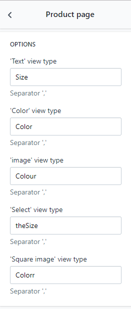
For example, if you want colors to be images, then enter "Colour" into the 'Image' view type field. But if you want sizes to be color buttons, then enter "Colour" into the 'Color' view type field.
If you need to edit some option in the frontend, open Sections -> Product Option Settings, then press Add product option setting.
Press the "Add another option" button if you need more ones.
To link variants with filters create tags in the [Option name]_[Option value] format, for example, Size_XL.
Note: Use color names from the X11 chart. If a color name constists of 2 words, type them without a space in 1 word, for example, Deeppink.
To customize option view types in the product pages open Theme settings -> Product page.
There are 5 possible option view types. Enter the desirable option into the field of the view type you want to display.
How to customize view types of product options for Shopify
For example, if you want colors to be images, then enter "Colour" into the 'Image' view type field. But if you want sizes to be color buttons, then enter "Colour" into the 'Color' view type field.
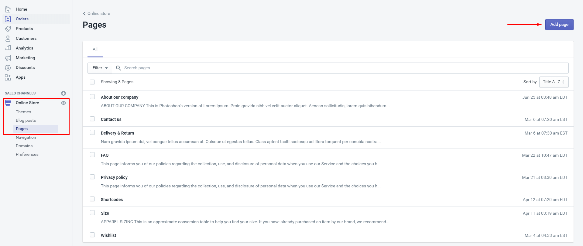
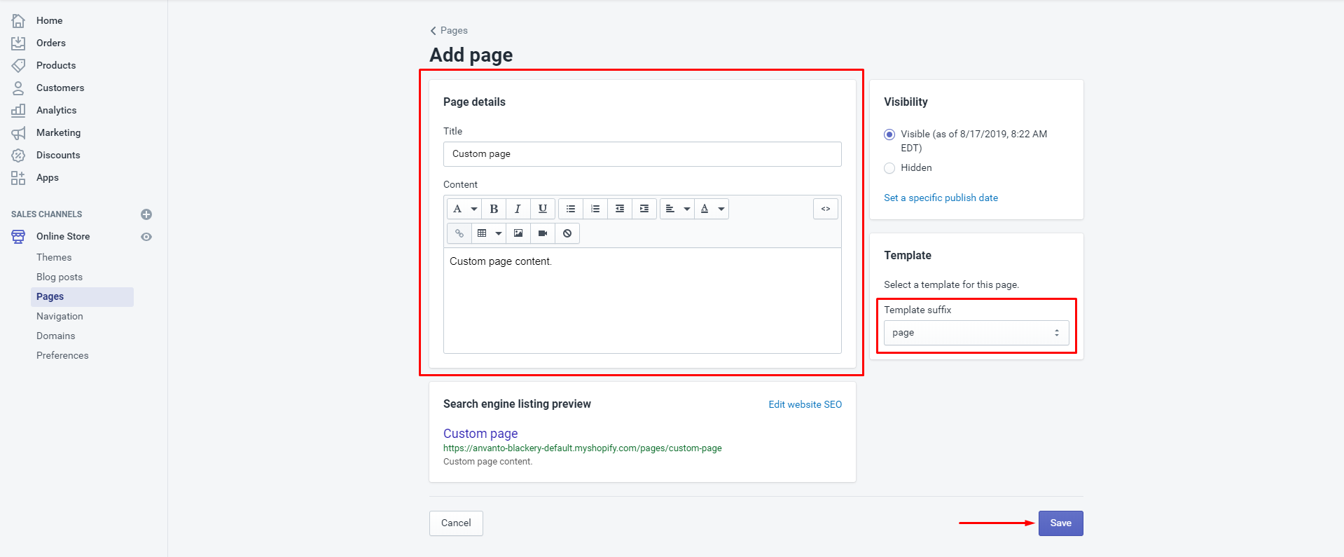
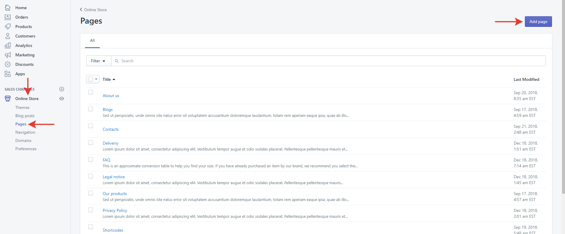
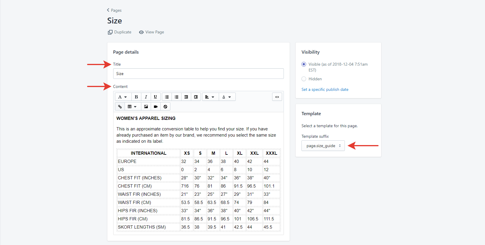
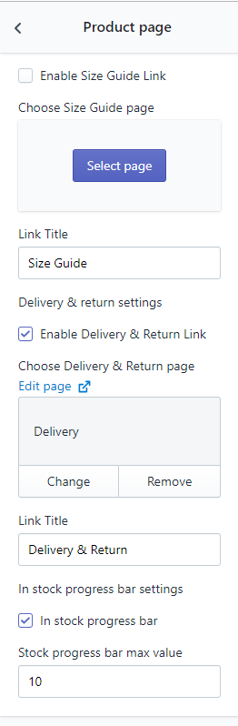
First of all you need to create a Size Guide page and a Delivery & Return page. Open Online store -> Pages, then press Add page.
Enter its title and content, then select the page.size_guide template suffix (or the page suffix if you create the Delivery & Return page) and save. You can use our size guide table (the code is here) or create your own one.
Open Theme settings -> Product page and find the Size guide, Delivery & Return option group.
Select the pages which were created previously in the appropriate fields, enable links and enter their titles.
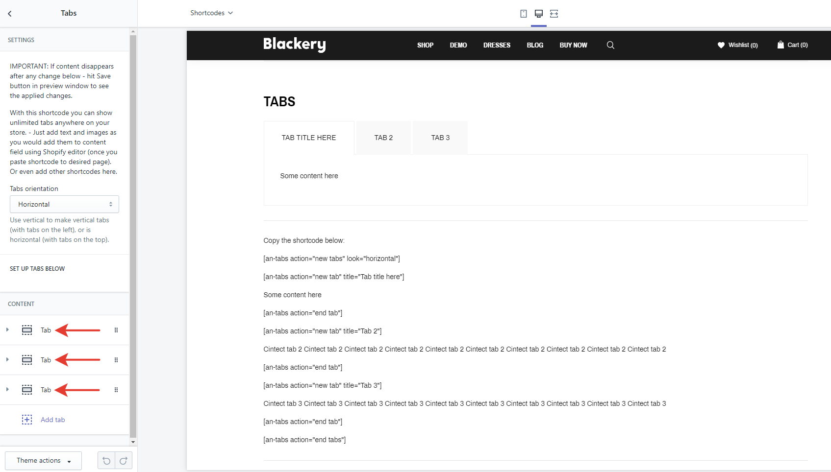
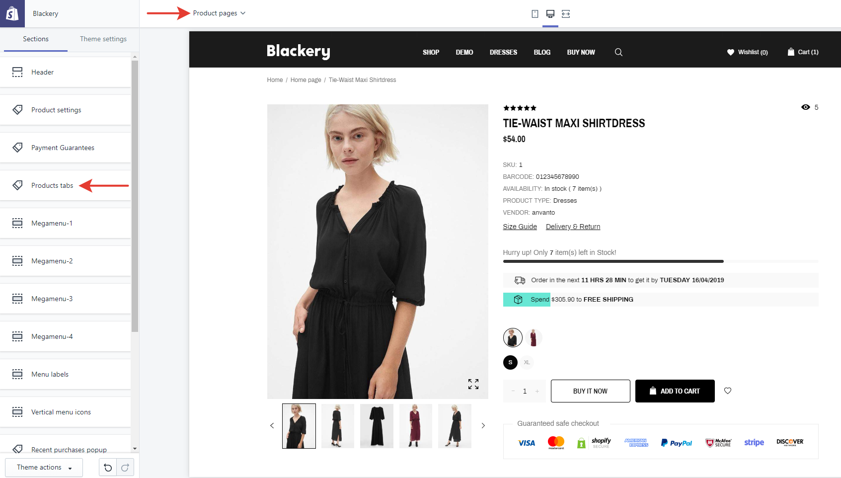
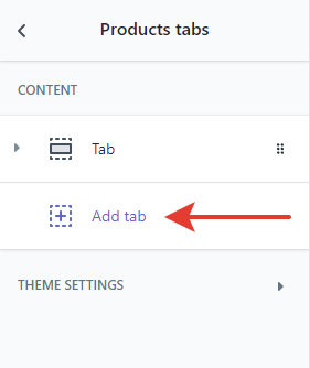
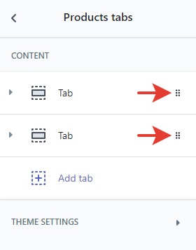
To configure product tabs select Product pages at the top panel, then open Sections -> Product tabs.
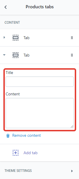
Press the Add tab button. Enter the title and content. If neccessary reorder tabs.
To configure Product Reviews open Theme settings -> Product page and find the Product Reviews options group.
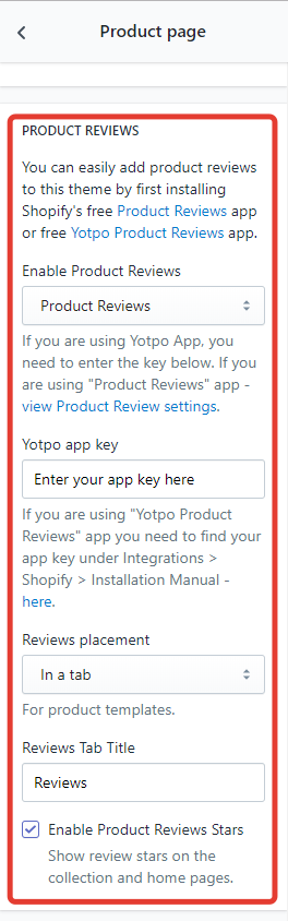
The theme is compatible with Shopify Product Reviews, Yotpo Product Reviews and Ali Reviews. Install any of these apps and select it in the list.
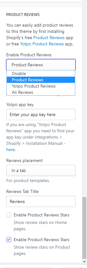
If Yotpo app is selected, then enter its app key. If neccessary edit the Product Reviews tab placement and the title.
Enable or disable Product Reviews Stars — they will be displayed in the home page and collection pages.
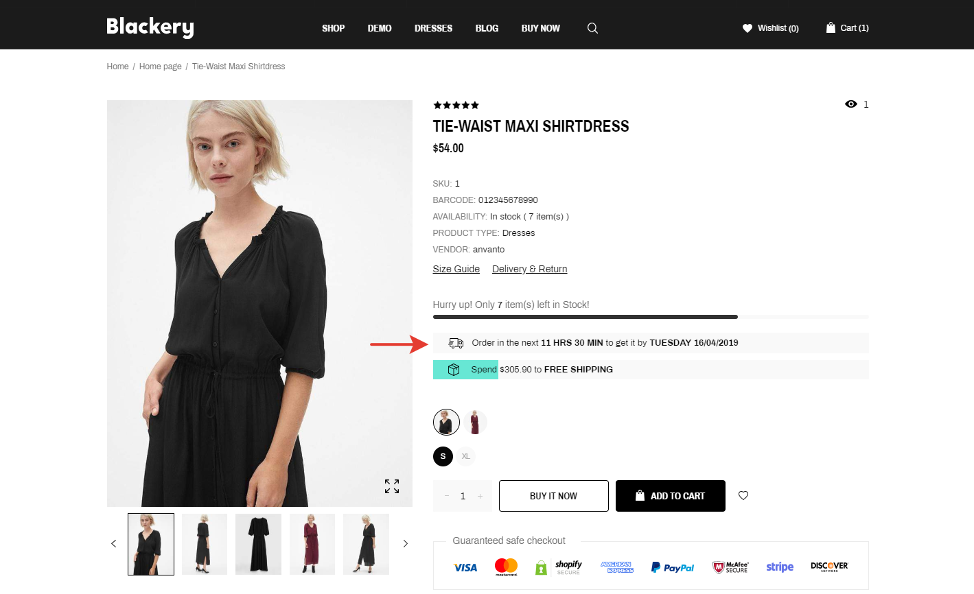
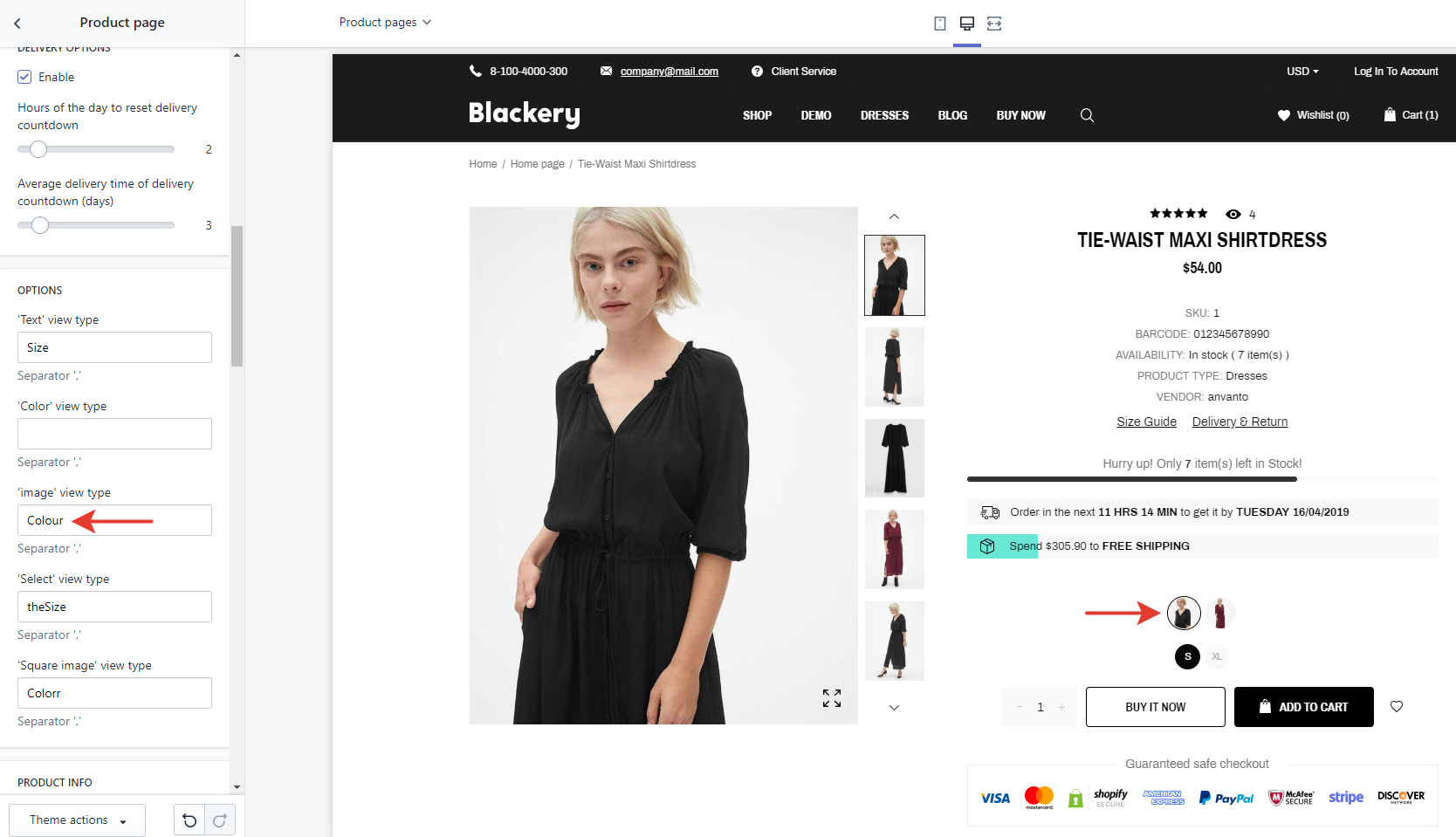
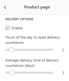
Open Theme Settings -> Product page. Scroll the list of option down to Delivery options.
Enable or disable the bar with the appropriate checkbox.
Select the time of the day when the delivery countdown is reset. For example, you start packing and sending orders at 5:00 PM, so you should select 17 hours to notify users on that.
Finally, select the average delivery time in days.
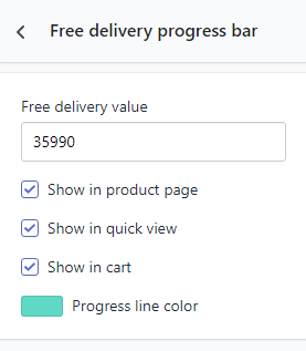
Open Theme Settings -> Free Delivery Progress Bar.
Select pages where you want the bar to appear with the appropriate checkboxes.
Customize the color of the bar and enter the value of the order in default currency when a user gets free shipping.
Note: 35990 = 359.90$
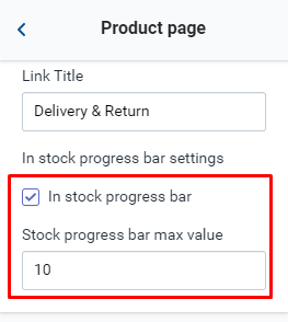
Open Theme Settings -> Product page.
Enable or disable the bar with the appropriate checkbox.
The option takes the rest of the product from the inventory field. To motivate visitors to make a purchase you are able to limit the displayed maximum value.
Colors
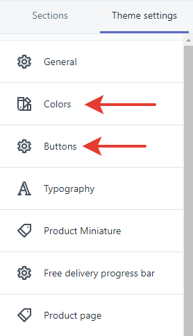
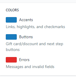
If you need to customize colors of body text, links, breadcrumbs, header, footer and navigation bar, open Theme settings -> Colors and set desirable colors.
If you need to customize colors of buttons, open Theme settings -> Buttons and set desirable colors.
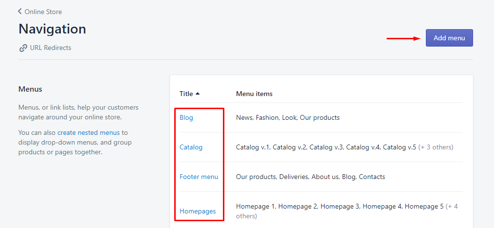
Menu
Before starting explanation we need to distinct 2 things: menus and menu items.
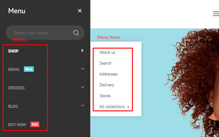
The first thing you need to do is yo create menus. Open Theme settings -> Main Navigation and select the “megamenu” style. Now Megamenu items are available to customize.
Press «Add menu» or edit any of current ones.
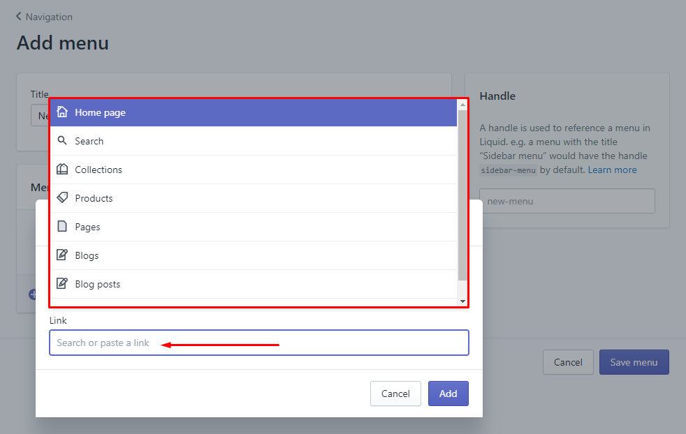
Enter the title and press «Add menu item».
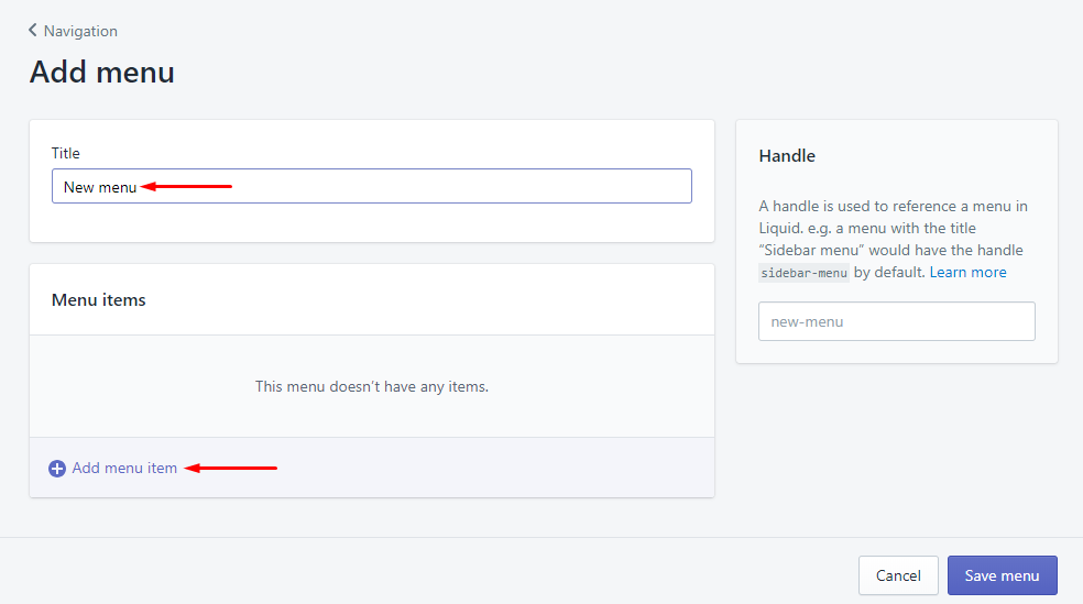
Enter the title of the menu item.
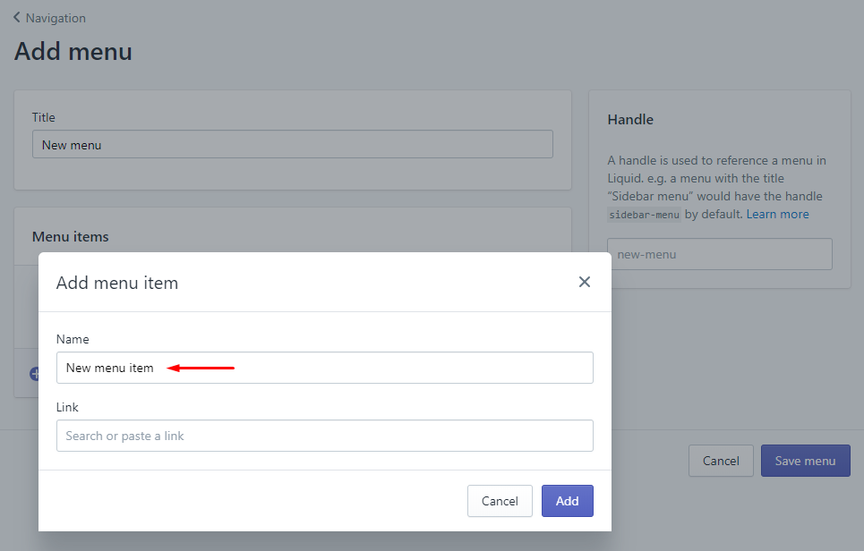
Then select the link of the menu item. It can be either an eternal page (select it from the list) or an external link (just paste it into the field). Then press «Add» and save the menu.
Open Theme settings -> Main Navigation and select the “megamenu” style. Now Megamenu items are available to customize.
Watch the video or read the instructions below.
- 1. Creating a navigation menu
- 2. Applying MagaMenu style to menu items
- 3. Creating content in MegaMenu items
- 4. Managing content, dropdown background
Tick the “Enable MegaMenu Item” checkbox and enter a title of the navigation item you want to attach to the MegaMenu item.
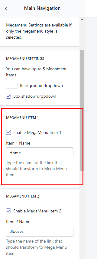
After enabling and attaching new Megamenu section with its own order number appears in the section constructor.
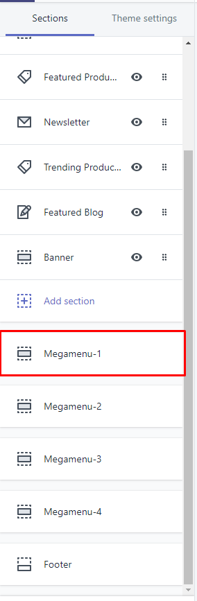
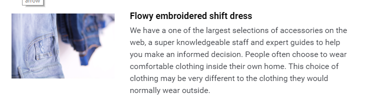
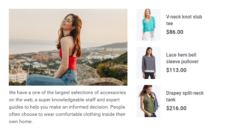
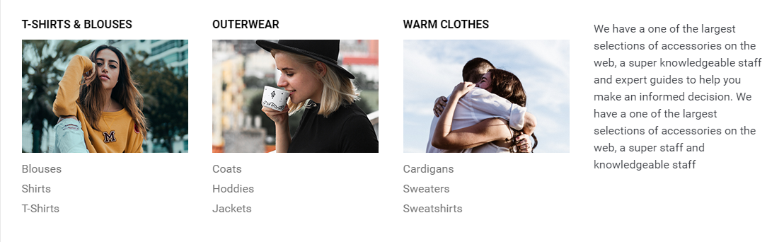
Open the Megamenu item you want to modify. By default, there are some widgets. Press the “Add content” button to add a new one.
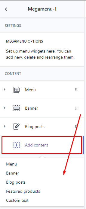
Each widget has its own settings, so experiment on them to get the best use of it.
Look at the screenshots with filled Megamenu item to inspire yourself.
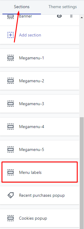
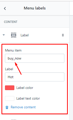
Open Sections -> Menu labels -> Add label
Note: Use "_" instead of a space.
Homepage
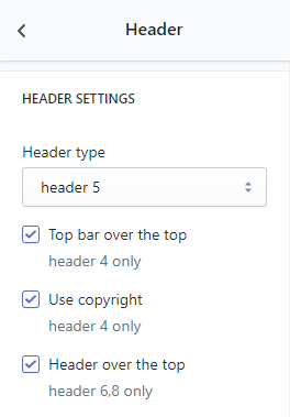
To change the header type open the Theme settings -> Header, then select one of 16 header types.
Some headers have additional options such as «Header Over The Top» and «Use Copyright», check them or uncheck if neccessary.
Enter its maximum width in the header. Check the «Use custom logo» upload your logo or leave the field unchecked and use the default one.
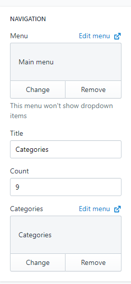
Navigation bar consists of 2 blocks: a vertical menu and a category menu.
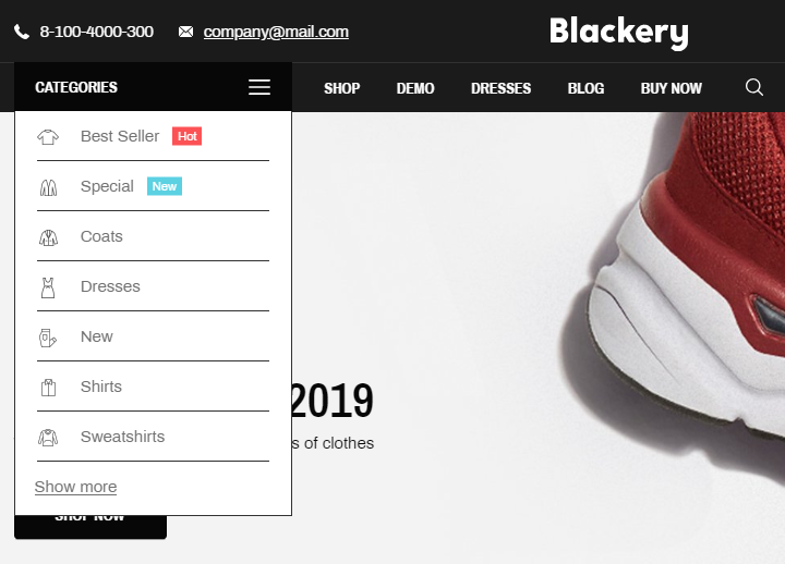
To configure the vertical menu, select a menu from the list and enter the number of menu items which are not hidden with the «Show more» button.
To configure the category menu, select a menu from the list.
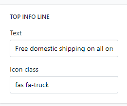
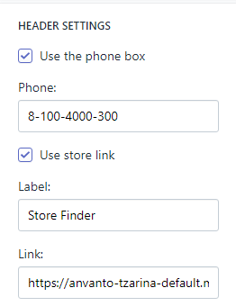
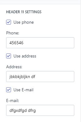
If you use one of the following header types: 1, 2, 3, 4, 5, 8, 12 — enter the text of the Top Info Line and paste a desirable icon class.
Other header types includes links and contact info. Edit them with the appropriate fields.
Open Sections -> Footer, then select one of 12 footer types. Upload icons of available payment methods and, if neccessary, paste links.
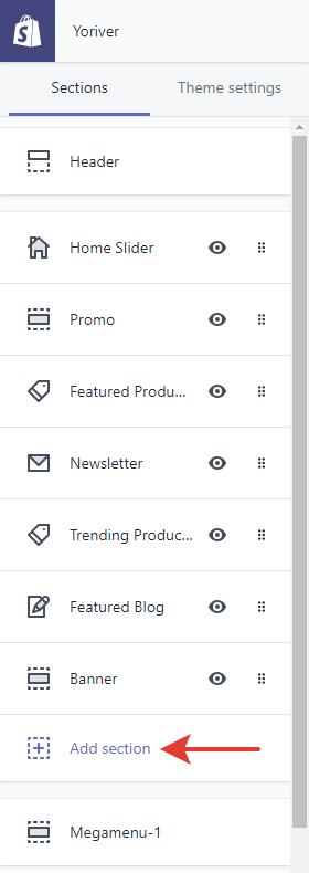
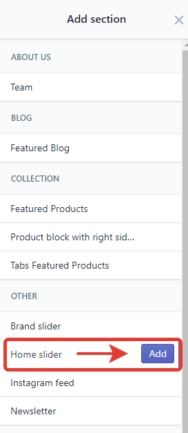
To create Home Slider open Theme settings, press "Add section", select "Home Slider" and press "Add".
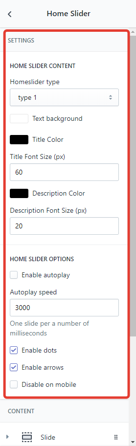
Select Home Slider type, configure colors, font sizes, autoplay and view options.
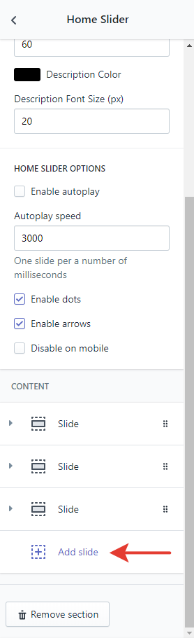
To add new slides press "Add slide", enter its title and description, upload an image and paste a link.
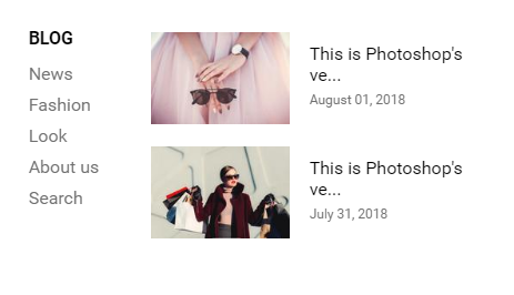
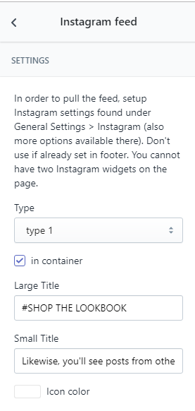
Open Sections -> Instagram Feed. Select a view type of the widget, enter the title and the subtitle and set the color of the icon.
Change the title of the bar and select it's view type: full width of sidebar.
Important! How to get an access token: https://youtu.be/D422iLrdmCo
Collections Pages
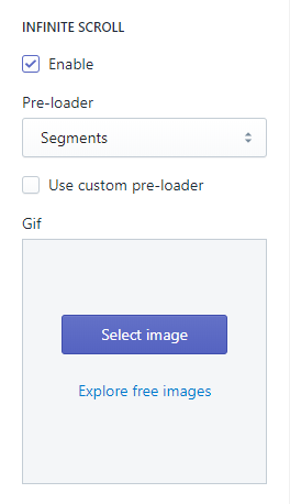
Open «Theme Settings -> Collections Pages». The Infinite Scroll option replaces default pagination system: next page is loaded automatically when a user reaches the end of the product list loaded previously.
If you don't need Infinite Scroll, disable it by unckecking the option.
Change the preloader with one from the list or upload your own one and check the «Use custom preloader» field.
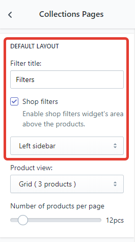
Open Theme Settings -> Collections Pages. If you don't need the filter bar in the catalog, disable it by unckecking the option.
Change the title of the bar and select it's view type: full width of sidebar.
Cart Page
Open Theme Settings -> Checkout Page. Select Drawer to open the cart in the right drawing sidebar.
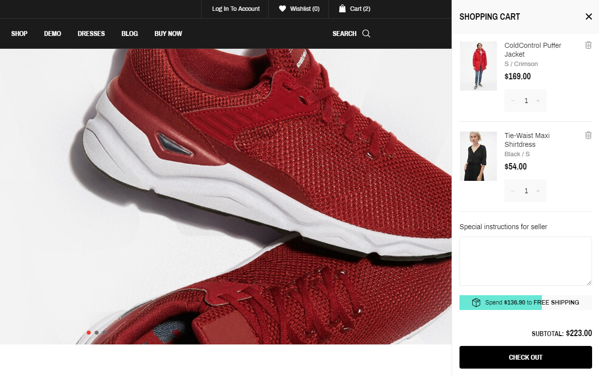
Open Theme Settings -> Checkout Page. Select Page to open the cart in the separate page.
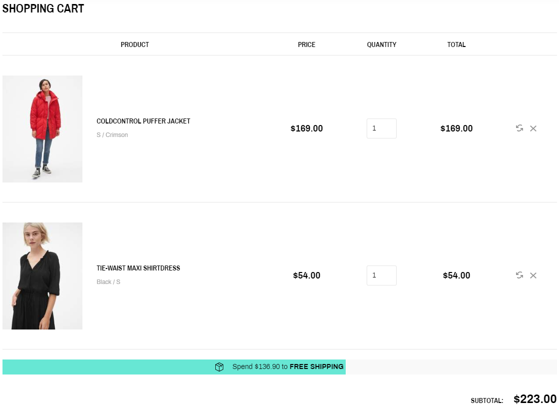
Open Free Delivery Progress Bar point to get more information.
Checkout Page
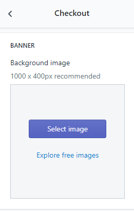
Open Theme Settings -> Checkout Page.
If neccessary, upload custom image that is diplayed in the checkout page header.
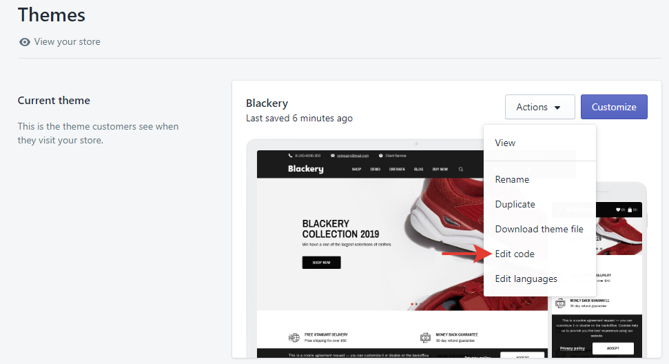
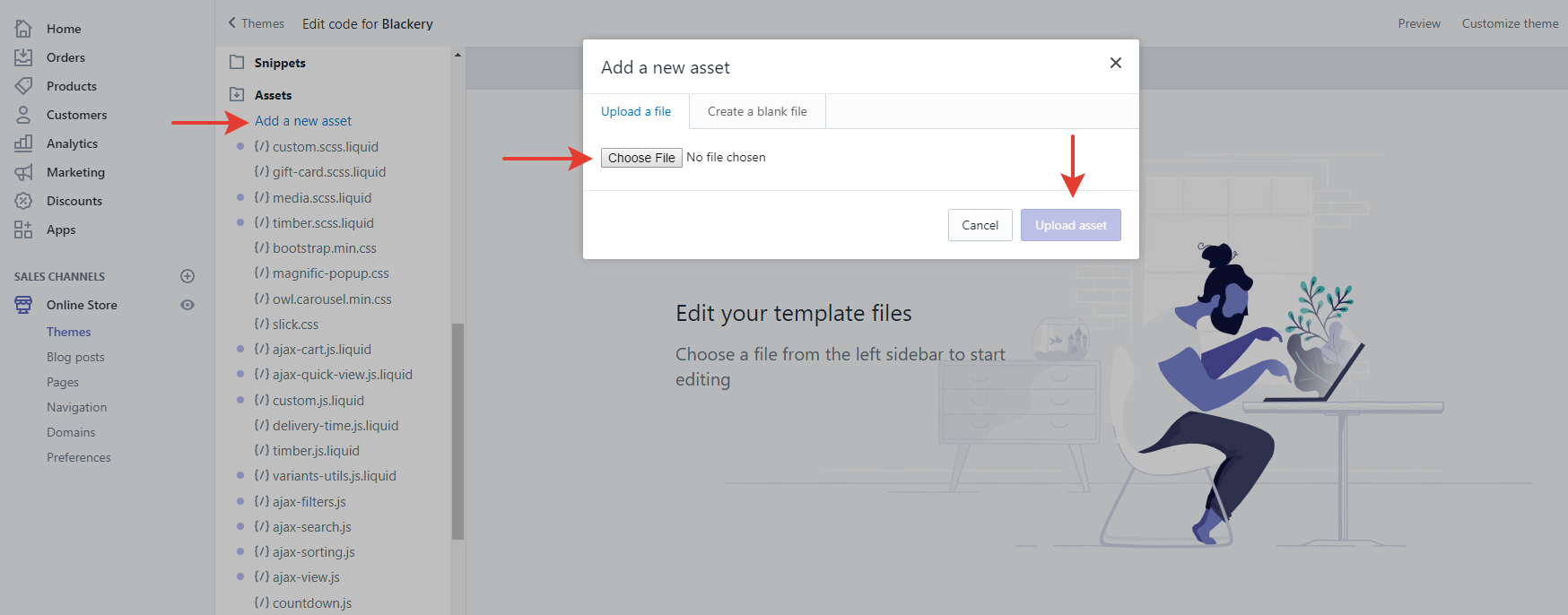
Open Online Store -> Themes, then press Actions -> Edit code.
Find the «logo.png» asset and delete it.
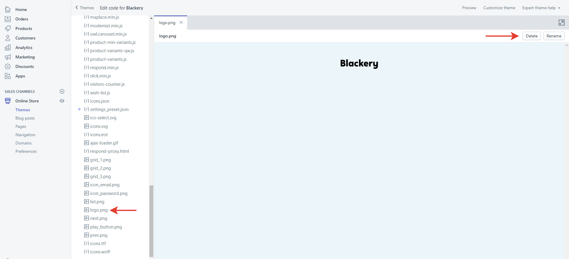
Rename your current logo to logo.png. Press «Add a new asset», select a new logo and press «Upload asset».
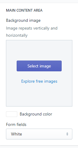
Open Theme Settings -> Checkout Page.
If neccessary, upload background custom image or set a background color. Then select the backgroud of form field: white or transparent.
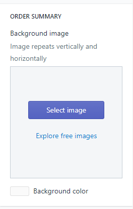
Open Theme Settings -> Checkout Page.
If neccessary, upload background custom image or set a background color.
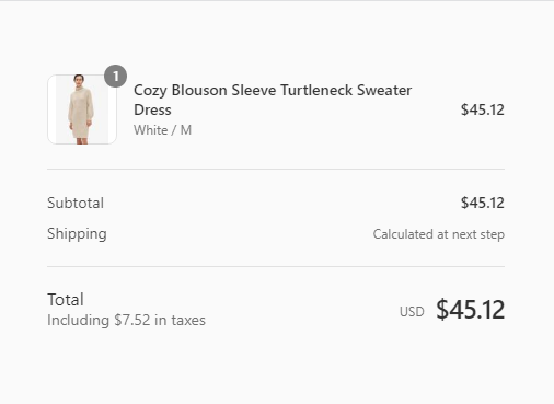
Open Theme Settings -> Checkout Page.
Select the font of heading and the font of body text.
Open Theme Settings -> Checkout Page.
If neccessary, change colors of errors, buttons and accents.
Other
1. How to edit the copyright text?
- Go to Theme settings -> General and change the text in the Copyright text field.
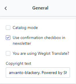
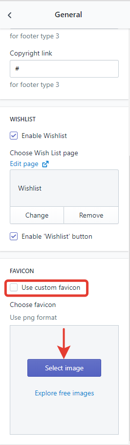
2. How to change the favicon?
- Go to Theme settings -> General
- Check the Use custom favicon field and upload the favicon.
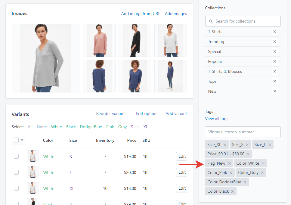
3. How to add product labels?
- Edit a product.
- Add desirable tags in the following format: Flag_[TagName], for example, Flag_New or Flag_-20%.
Copy the code and paste it to the Content field.
| INTERNATIONAL | XS | S | M | L | XL | XXL | XXXL |
|---|---|---|---|---|---|---|---|
| EUROPE | 32 | 34 | 36 | 38 | 40 | 42 | 44 |
| US | 0 | 2 | 4 | 6 | 8 | 10 | 12 |
| CHEST FIT (INCHES) | 28" | 30" | 32" | 34" | 36" | 38" | 40" |
| CHEST FIT (CM) | 716 | 76 | 81 | 86 | 91.5 | 96.5 | 101.1 |
| WAIST FIR (INCHES) | 21" | 23" | 25" | 27" | 29" | 31" | 33" |
| WAIST FIR (CM) | 53.5 | 58.5 | 63.5 | 68.5 | 74 | 79 | 84 |
| HIPS FIR (INCHES) | 33" | 34" | 36" | 38" | 40" | 42" | 44" |
| HIPS FIR (CM) | 81.5 | 86.5 | 91.5 | 96.5 | 101 | 106.5 | 111.5 |
| SKORT LENGTHS (SM) | 36.5 | 38 | 39.5 | 41 | 42.5 | 44 | 45.5 |